Let’s talk about floats and positions. Often a headache for beginning web developers, taking a moment to understand how they work can make a huge difference. Floats and positions can be used for many things, from applying text wrap to an image, to controlling the flow of your content, to building a well structered page layout. A basic understanding of how these work is necessary to becoming a solid web developer.
What is a float
The basic concept behind a float, and it’s purpose, is found in everyday centuries-old publishing. We are accustomed to looking at a newspaper, or reading a magazine, and seeing pictures with text. Usually, that text is neatly wrapped around an image in some manner that flows with the rest of the page. In some ways this saves space, allowing for more content to be shuffled onto the page. Although it can also make something look more appealing to the eye, and grab your attention. Floats are a result of the need to accomplish this on the internet through HTML. This is the simple idea of why we have floats in CSS. We can use this tool to position and layout our web pages how we see fit.
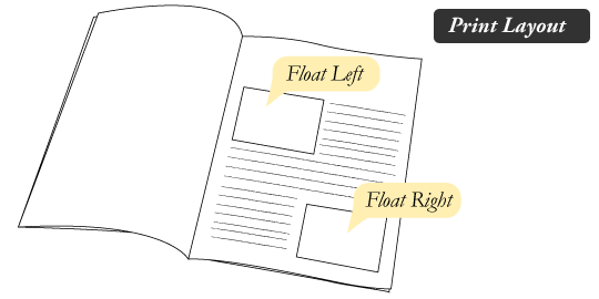 To the left you can see an example of using floats in everday print. The text is wrapped around the images, hence the term “text-wrap”. By wrapping the images with text, we are integrating them into the pages’ flow. We wouldn’t want the text of a printed page to just run over the image, that would defeat the purpose of the image right? A lot goes into designing the flow of content, and being able to place an image where the author or page designer wants it is essential.
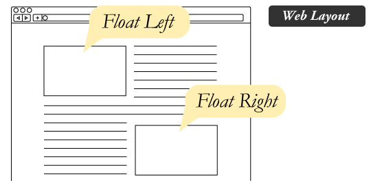 To the right you can see another example of floating images, only this time we have done it for a website. Looks similiar doesn’t it? That’s becuase it is this same idea. We are integrating images into the flow of our page when we
 float them. We could just let our text run over the top of the image, but that would make the image rather useless if it was an integral part of our page content. We could also just let the image sit on it’s own line, which is what HTML would do by default. Maybe this is how your content is designed to flow. But by using floats as a web developer you at least have much greater control over what you can do. The two images embedded in the content above had the float: left and float: right CSS style applied to them.
Cool, now how can I use this thing?
Like above, you can use this thing to wrap text around your images. But what else can it do? How about control the flow of your website’s entire layout? Of course it can! Use the float property on your page’s <div> containers so you can float them next to each other.
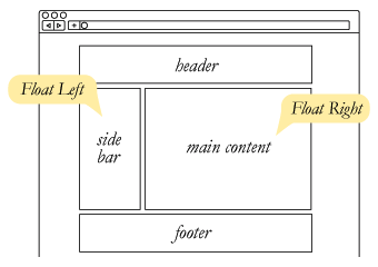
In the above image you see a simple example where two containers have used float: left and float: right to create a nice layout and flow for the page. Let’s write some simple code doing this in action! Paste the code below into an empty HTML file:
<!DOCTYPE html>
<html>
<head>
  <link rel="stylesheet" type="text/css" href="float_sample.css">
  <title>Example CSS floats page</title>
</head>

<body>
<div class="top">I'm the top box</div>

<div class="left">I'm a left box</div>

<div class="right">I'm a right box</div>

<div class="clear"></div>

<div class="bottom">I'm the bottom!</div>
</body>
</html>
Now paste the accompanying CSS code into an empty CSS file:
.top {
  height: 40px;
  text-align: center;
  border: 1px solid black;
  margin-bottom: 5px;
}

.left {
  height: 40px;
  float: left;
  border: 1px solid black;
  width: 25%;
}

.right {
  height: 40px;
  float: right;
  border: 1px solid black;
  width: 74%;
}

.bottom {
  height: 40px;
  text-align: center;
  border: 1px solid black;
  margin-top: 5px;
}

.clear {
  clear: both;
}
Here is what you it will look like:

Clear it up
Examine the code, not much too it right? You might notice one piece of code in the HTML where I create an empty container with a class of clear. If you reference the CSS file you will see that I give the class of clear one property, clear: both. To know why this needs to be there requires understanding of what floats actually do to your page’s flow in order to accomplish their goal. When we set the properties float: left and float: right on their respective containers, we allowed them to float next to each other, but what happens to the rest of the page? Unfortunately closing the floated containers does not end the float CSS property. When you a declare a float it breaks the page flow, forcing all proceeding content to conform the the float rule. If we were just using this on an image, we might not even notice that the page is still trying to build itself around the image after it has already been initally wrapped by text, but it is. In the case of creating page layouts this will become noticeable. Look what happens in the image below. I have removed the clear from the above CSS code to show you what happens to the bottom container:

Notice how the bottom container looks like it is now part of a middle container with the left/right boxes. The HTML code still says otherwise, but the browser is attempting to float the bottom container around the right container, since the page is now set to float: right around it. There are a few different tricks to clear your floats, in the example code I just created an empty container after my floated content and used the property clear: both to reset the page flow back to default. If you wanted, you could just use clear: left or clear: right if you were only looking to clear one of the float properties.
Let’s talk about positions
So now you can use floats to manipulate objects around each other, and even create entire page layouts. But what if you just want to tell something where it should be? This is where we can make use of the CSS property position. Position can have four different values:
- Static: The object is static and follows all of it’s default properties. (Default)
- Relative: You will now be able to move this object relative to it’s static position.
- Absolute: Moves the object onto it’s own stack, or sometimes referred to as a layer. This object now essentially has it’s own flow completely removed from everything else on the page.
- Fixed: Same as absolute, except the object will be fixed to it’s position on the window. (An absolute object will still scroll with the page, a fixed object will not)
Take a look at the code example below where I create the two simple boxes:
HTML:
<!DOCTYPE html>
<html>
<head>
  <title>CSS Positions Example</title>
  <link rel="stylesheet" type="text/css" href="styles.css">
</head>
<body>

<div id="top-box">
</div>

<div id="bottom-box">
</div>

</body>
</html>
CSS:
#top-box {
  width: 400px;
  height: 100px;
  background-color: lightblue;
}

#bottom-box {
  width: 400px;
  height: 100px;
  background-color: green;
}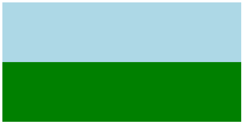
Remember, by default both of those <div> boxes have a position of static. But if I set the bottom box to position: relative, I can now move that box in any direction in relation to it’s default position in the HTML flow of the page (in this case, underneath the top box).
Updated CSS:
#top-box {
  width: 400px;
  height: 100px;
  background-color: lightblue;
}

#bottom-box {
  width: 400px;
  height: 100px;
  background-color: green;
  position: relative;
  top: 50px;
  left: 50px;
}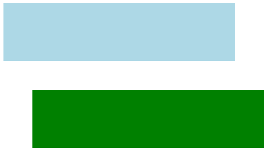
We can use the top, right, bottom, and left CSS properties to move the box. In the example I moved the green box 50px from the top and 50px from the left of it’s static position.
Now let’s go ahead and move the green box neatly on top of the blue using position: absolute. Here are the changes:
#top-box {
  width: 400px;
  height: 100px;
  background-color: lightblue;
}

#bottom-box {
  width: 400px;
  height: 100px;
  background-color: green;
  position: absolute;
  top: 50px;
  left: 50px;
}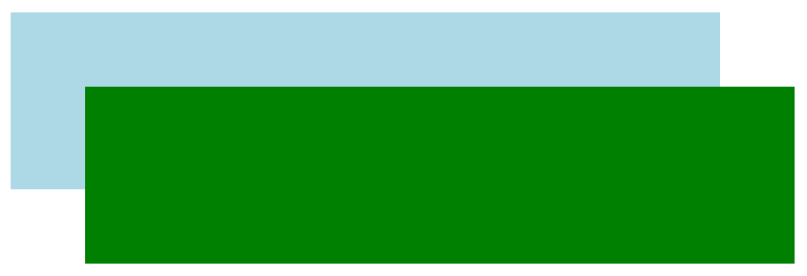
Because we set the box to position: absolute it now exists on it’s own stack, with it’s own page flow. So moving the box top: 50px and left: 50px will be in relation to the top corner of the page.
Nice, now what?!
You have a better understanding of how to use the CSS properties float and position. Take some time to play around the with the power they offer in web design.
